top of page
EXTINCT
2026
the brief
Design a styleframe whose primary job is to communicate mood, tone, and emotional intent.
software
Photoshop
credits
Design, Karla Robledo
inspiration
I was inspired by Andy Warhol's vibrant pop art and the MISSING milk carton kids campaign. I want to have something eye catching, but satirically saying an urgent message: the missing "kids" are really extinct animals, some extinct as recent as 2020.

Andy Warhol

research
According to the Living Planet Report in 2024, 73% of wildlife has declined from 1970-2020. I researched extinct animals through ifaw for names, extinction dates, and general information. The species I feature are:
Dodo (raphus cucullatus) c. 1670
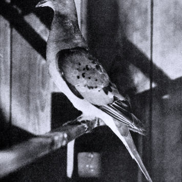
Passenger Pigeon (ectopistes migratorius) c. 1914
Megalodon (otodus megalodon) c. 2.6 Mya
Quagga (equus quagga quagga) c. 1883
Tasmanian Tiger (thylacinus cynocephalus) c. 1936
Woolly Mammoth (mammuthus primigenius) c. pleistocene transition to the holocene epoch
Saber-tooth Cat (smilodone) c. end of the ice age
Gigantopithecus (gigantopithecus) c. middle to late pleistocene epoch
Splendid Poison Frog (oophaga speciosa) c. 2020
Pinta Giant-Tortoise (chlenoidis nigra abingdonii) c. 2012
Chinese Paddlefish (psephurus gladius) c. 2022
Slender-billed Curlew (numenius tunirostris) c. 2024
Po’ouli (melamprosops phaeosoma) c. 2021
Cryptic Treehunter (cichlocolates mazarbarnetti) c. 2019

process

I initially started with straight-on milk cartons and two animals per label, aiming for full accuracy. However, I quickly realized this affected legibility and the general understanding of the message I was trying to portray— so I went back to the drawing board.

My main feedback was that the milk carton got lost. I decided to narrow down my composition: 8 frames instead of 36, and milk cartons at a 3/4 angle. I also made each label have one animal only along with being enlarged for better legibility at its smaller size.

individuals

burst
Putting together my different individual milk cartons, I created a burst for social media that has close-ups of the labels, aligning them to further heighten the layout and urgency of the message. I still kept the halftone and texture to stay reminiscent of the Andy Warhol look I was referencing, and with the context of the new revised styleframe with the cartons at a new angle, this reads much clearer.

bottom of page


